What’s involved in designing a wordmark?
I mean, it’s only text. How hard could that be? All you do is pick a font from your computer or a free font website. I can do that. Why would I pay for that? It’s easy.
Well, let’s explore that idea.
The role of a Designer is to put thought, time, and effort into studying and understanding the art of typographic design and, in this case, wordmark design. Designing with fonts is more than just collecting fonts, and collecting fonts is more than simply downloading all the fonts and typeface “families” you can find for free online. When collecting fonts and typeface families, it’s important for the designer to have a solid foundation in typography, to understand what the individual parts of letterforms do and how it affects the viewer’s experience. Fonts are chosen for their ability to communicate a specific emotion or intention.
When building a library of high-quality fonts and typefaces, they need to be kept impeccably organized so that the designer can access the exact style they want, without wasting time sifting through their entire collection, which can be in the thousands. This is done by investing in and learning specialized font organizing programs. Setting up a good library takes a lot of time and money, but it’s worth it.
As with most things, you get what you pay for and not all fonts are free. Many free fonts are of very poor quality. They can contain awkward shapes and inconsistent kerning (the space between the individual letters). These are things that can make an otherwise good wordmark look and feel cheap or amateur.
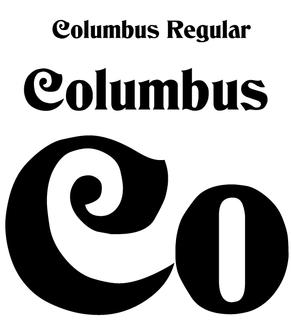
Here’s an example of a popular free font, Columbus Regular. Although it may look intentional, the forms are just a poorly traced version of the original for-purchase typeface.
As you can see, the shapes in this font are very uneven. They may look fine at a small size, but when enlarged, this font is really crude.
Fonts have the ability to communicate.
If we look at the psychology of typography, we can learn how typeface (families) and their different individual weights (known as fonts) can trigger different reactions from viewers. When we see a word set in a bold sans-serif font, especially if set in all caps, it has the effect of communicating a sense of authority, urgency and strength. It has a greater visual presence; therefore, it has more implied power.
The opposite is also true: A thinner, lighter font denotes a sense of delicacy and refinement. This can be used to communicate a feeling of class and style or a sense of airy lightness appropriate to a fashion magazine or luxury products.
Of course, these are only the most rudimentary examples, but you can well imagine how bad any tech corporation would fare if their wordmark was set in the much-maligned Comic Sans.

What if we redesigned the TIME wordmark using an even bolder, harder-edged font to give it even more authority?

There are literally thousands of different font choices out there, all able to communicate different messages before even considering the words that are typed. It is a designer’s job to understand these differences and to continually study their effects. The designers here at Logo Monster have backgrounds in classical typography and have spent decades working with type, developing tools and resources that allow us to create superior typographic designs, affecting marketing, advertising, and your bottom line.
Those effects on public perception are incredibly important when designing a corporate wordmark. This is going to be the first thing people see from your company, and it needs to communicate the right attitude and feeling.
What makes a good wordmark?
Let’s explore one example of an iconic wordmark- TIME Magazine. The TIME Magazine logo was made using a custom font similar to, but not identical to, C794M Roman Regular. Not only does the slab-serif font capture a sense of classical strength, history, and tradition, but the fact that it’s set in all caps also implies presence and authority.


What does the logo present now? A simple change and it has become overpowering and no longer has that element of history and noble truth. In changing the font, this wordmark has lost the thing that makes it classic and iconic.
This is an example of how a font choice can affect the public perception of a company. All these considerations have a huge influence on one’s ability to make money with a new logo. It’s not just investors who can be swayed by a good wordmark: the public and target audience are equally critical of how a wordmark looks and how it makes them feel.
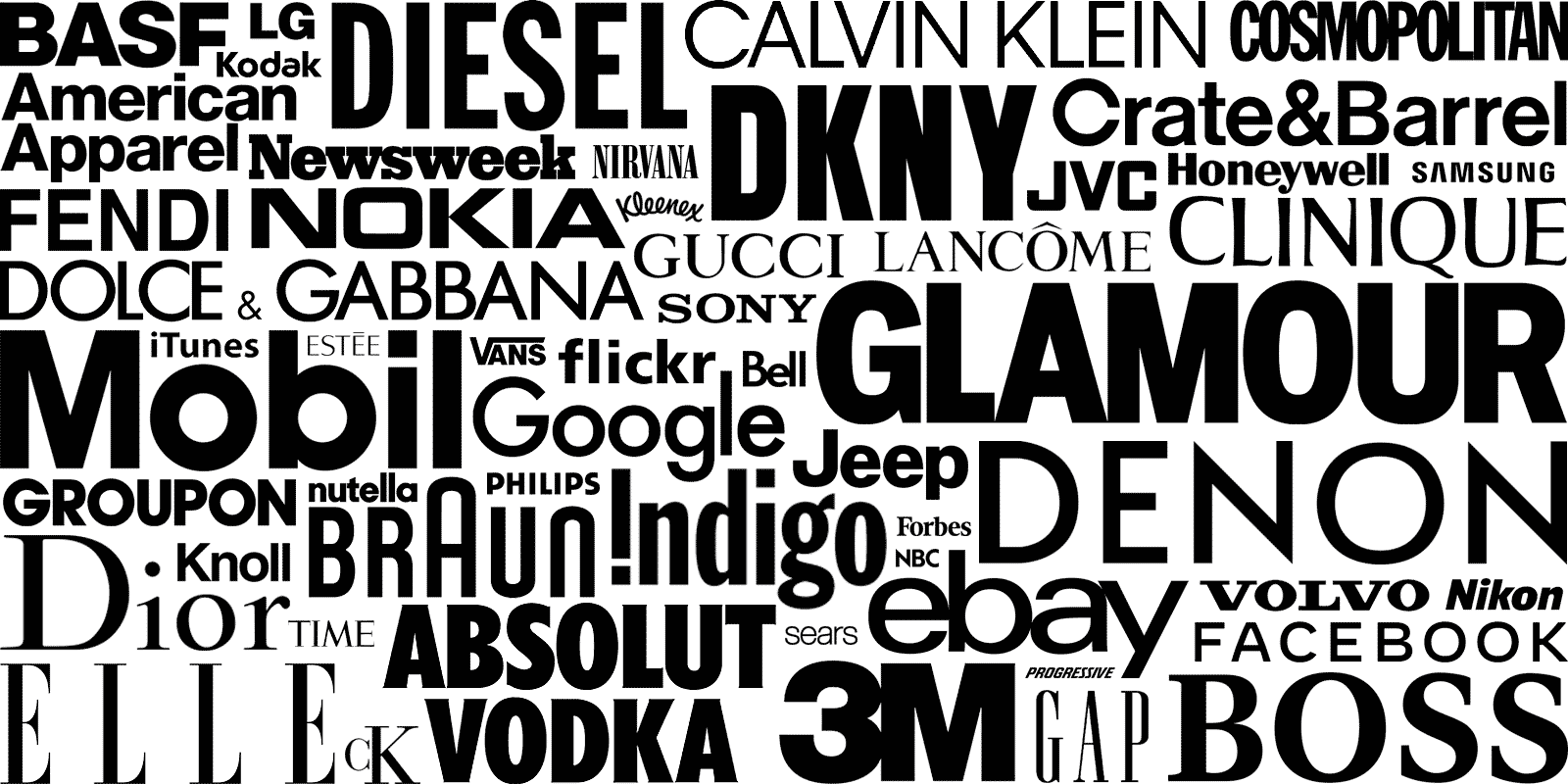
In the meantime, check out this collage of 55 famous wordmarks and consider if their choice in font played a role in the success of their brand.


